Showing posts with label Film and Illustration. Show all posts

Sunday, March 13, 2011

Film Posters in Turkish Cinema: 80's

1980's were hard times for Turkey because of the military coup and its administration for several years. Turkey was also a mess in terms of political over-activity and so just before the 80s, but it was another and probably bigger mess after the intervention as cinema and other arts faced lots of censorship and prohibition. As a counter effect, in the later years of 80s, social cinema flourished in the country aside diminishing Yeşilçam melodramas and more and more stars took part in these kind of films.

Sen Türkülerini Söyle, 1986
Kadir İnanır was one of the most charismatic and handsome stars of the era and there is no other poster among his films and among all other Turkish Cinema posters that shows only the star's face as a close-up and nothing more. As the film simply tries to tell the concerns of adapting to the newly established society of an old activist just out of prison, with the beautiful gesture of the star, it reaches to its purpose.

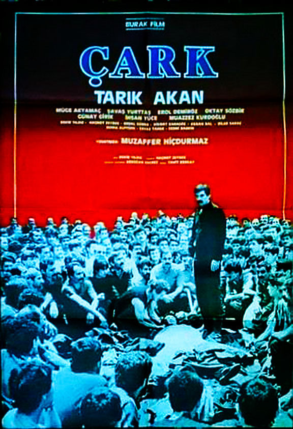
Çark, 1987
It seems and it is a film about unity and unions. Everybody sits and listens to what the star of the film, the leader, has to say. Maybe only Tarık Akan could be in color but that could ruin the unity. Maybe the red gives the gloomy, muggy atmosphere but there is no harmony with upper side and fonts.

Zengin Mutfağı, 1988
A satire of the capitalist system through a chef in a wealthy house. Using one shot as a background is safe. Shot clearly shows the star and the satire. I did not get the meaning why did they write the M italic and in a different font, looks bad.

Karılar Koğuğu, 1989
It is one of the best posters I have ever seen in Turkish Cinema. Kadir İnanır wears a white jacket and a clear look in his face but he has lots of stories, joys, sufferings projected in his back. Extremely symbolic as it is a prison film. I did not like the face double up and the lines lined down but the font is real and the poster is beautiful.

Sunday, February 27, 2011

Feel The Beat


Takeshi Kitano 北野 武 is an award winner film director, a well known actor especially as the Beat Takeshi character, a comedian and a presenter in Japanese T.V., an author a screenwriter and a poet who wrote more than thirty books, and the Head Professor of Film and Media Studies Department of Tokyo University of Arts. He does almost everything in his films from editing to art directing, from writing the screenplay to directing the film and starring in it. He won more than fifty awards including a Golden Lion winning, nominations and a Golden Palm nomination. Alongside his mostly known capabilities which are more than enough even for the most capable man, he is also a painter who opened an exhibition in Paris recently called "kid of painting". Even if his father was a painter, he does not like to talk a lot about his own paintings. He does not sell them; instead gives away.

These are some of the paintings that Kitano used in his masterpiece Hana-bi (1997). In the film, they were made by a fellow ex-cop of Beat Takeshi as a part of the rehabilitation process as the cop cannot walk anymore.

Untitled, 1996
Untitled, 1996
Hana-Bi, 1996
Death, 1996

BEWARE! This is the exact scene in which paintings of Kitano are used. It can spoil everything if the film is not seen by you; it will be a pity as it is a master of masters' masterpiece.

Thursday, February 10, 2011

Less Known Posters of Just Before Millenium Alternative Reality Films

Sci-fi alternative reality films really flourished suddenly just before the second millenium of the accepted calendar. Nowadays there are millions of them, there are even T.V. series, but back then, they changed the life of so many people and made them question their existence etc. or just confused them. There are lots of things to talk about these four beautiful films, but here I would like to share their mostly unknown or foreign posters, one for each film.

Dark City, 1998
Dark City was first to come in these four. It came out in late 1998 and maybe influenced other three. Here in the poster, the creepy guys, aliens that make experiment on human race can be seen in the poster. By far worst poster of all for me. I have no idea what is going on in it.

The Thirteenth Floor, 1999
13th floor came early 1999, last year before the new millenium. This film is the lest known of these four and has only one poster for all countries, has no alternative one, so it doesn't count. Our guy walks to the end of the designed program to understand what is there at the end of the program, seeks the truth... Good idea on the poster, no big faces, no one is tried to be higlighted; instead film and its idea is highlighted.

The Matrix, 1999

Everyone's favourite, one of the best of its kind ever. Lots of new technique, solid cast, beautiful movie. Also, this poster is film's most mysterious one along with the eggy one. -They are coming out of the mist to kick some ass. Again no big faces pumping out of the poster, nothing much relieved: who plays Trinity?


eXistenZ came out only days before the end of old millenium. It has plenty of gross stuff, some headache and the smallest atmosphere of the four. Just like 13th Floor, it is not a widely known film even if Jude Law plays the leading part. Best poster out of all for me even if it looks like a dark love story. Does not show lots of sci-fi stuff, use of red, with cable shows the connection between people. This poster is not related with the film at all, as the film does not only focuses on the relationship or connection between the people through the games; it is only one of its themes. Not for this film, but a solid one.

Wednesday, February 9, 2011

A director painted in his film

In Barry Lyndon (1975), Stanley Kubrick wanted the photography of his film to have a resemblance to the 17th-18th c. paintings. To do that Kubrick got special Zeiss lenses from NASA in order to shoot in natural candle light, which is impossible with normal lenses. The result was marvelous and unique. Every shot, scene seemed like a portrait, a painting of the era.
Georges de La Tour, St Joseph, 1642

Georges de La Tour, Nativity, 1642, Louvre

Barry Lyndon, 1975

Barry Lyndon, 1975
Not only the night scenes but also the daylights shots resemble the 17-18th century paintings.

William Hogarth, The Assembly at Wanstead House. 1731

Barry Lyndon, 1975

William Hogarth, The Strode Family, 1745

Fragonard, la petit parc, 1765

Barry Lyndon, 1975